Using a Design System with the WordPress Block Editor: Theme.json
How to use design tokens from theme.json in the WordPress block editor
This is Part 1 of a 2-part tutorial. For Part 2: Block Types and Styles, click here.
In our previous blog post, we showed how you can import your design system from Figma into the theme.json of a WordPress theme. By doing so, you can ensure ongoing consistency across your digital properties.
Our new two-part series builds on that foundation by showing you how you can use imported design tokens from theme.json in the block editor. This will allow you to better organize your WordPress site to reflect your design system. There are two key goals:
- Understand the parts of theme.json relevant to design systems
- Modify and extend theme.json in order to utilize the imported design system
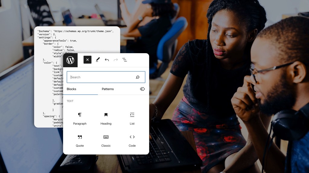
Understanding theme.json
theme.json is a configuration file that allows you to configure and theme the block editor, change block settings, and build the foundations to develop an entire block theme.
It’s meant to allow you to control the global settings and styles for your WordPress site. Every new WordPress VIP site comes default with the Twenty Twenty-Three theme, a block theme. This theme is a great starting place to experiment with a lightweight block theme and understand some of the powerful controls available in theme.json.
Modifying theme.json
Let’s start with the theme.json used in our previous blog post. Notice the custom section, where our bridge tool can insert and update a design system from Figma. This is the key section where you reference the various components of your design system (design tokens) to actually use the theme.json effectively.
Below we go over tips and strategies so you can take advantage of everything that theme.json has to offer.
Storing Design Tokens
While the location of your design tokens can be customized using the bridge tool, they should always be kept in the custom section of settings. This is the default location of the bridge tool, and should not be changed. This keeps them properly organized in a single location and may help avoid conflicts with existing custom theme sections.
Using Design Tokens
Let’s see an example of using the custom section of theme.json. Here we have a snippet we have defined a primary text color of green and a background of black:
"settings": {
	"custom": {
		"text": {
			"primary": "#00FF00",
			“background”: “000000”
			}
		}
	}
}
This allows us to reference these two colors anywhere within the theme.json using:
var(--wp--custom--text--primary) and var(--wp--custom--text--background)The following snippet ensures that by default, unless otherwise specified, every block will have a black background with green text on it:
"styles": {
	"color": {
		"text": "var(--wp--custom--text--primary)",
		“background”: “var(--wp--custom--text--background)”
	}
}
The schema for any key that you want to reference from your custom settings is:
var(--wp--custom–<location to the value with -- as a separator between each key>)The benefit is that you can reference all your design tokens using these keys while having one central location where the actual value is managed.
Best practices
- Use the WordPress-generated design token variables (e.g.,
var(--wp--custom--text--primary)) to reference tokens everywhere. Note the snippet provided above, where we reference the primary and background custom color, rather than using the actual value themselves. This ensures that when you want to update properties like text color you have to change only a single location, as the other locations are simply references. - The design tokens inserted into the theme.json are accessible with CSS outside the theme.json as well, using the same key referencing shown above. This applies to block development and other components used in a theme. They aren’t meant for usage only within the theme.json and should be reused in any custom CSS.
We recommend following both of these best practices to keep theme.json as a single source of truth. It will allow you to update design tokens easily, especially when you use automated tools like WordPress VIP’s bridge tool that connects to Figma.
Modify editor and block styles
The snippets above are a great way to dive into customizing the way blocks are styled. For example, you can change the default style for a block as well as what presets are available to pick from the block editor. This is useful when you want to be more granular and dictate exactly what built-in blocks used in your site will look like.
There are two key locations in the theme.json:
- Settings and settings.blocks—allows customization of settings generally available in the block editor, and tailored settings for individual block types.
- Styles and styles.blocks—allows defining of preset styling for the whole block editor, and per-block customizations.
For example, here’s how to ensure all headings have a default green (primary) color and a secondary color option:
"settings": {
	"custom": {
		"text": {
			"primary": "#00FF00",
			“secondary”: “#FF0000”
		}
	},
	“blocks”: {
		“core/heading”: {
			“color”: {
				“text”: true,
				“palette”: [
					{
						"slug": "primary",
						"color": "var(--wp--custom--text--primary)",
						"name": "Primary"
					},
					{
						"slug": "secondary",
						"color": "var(--wp--custom--text--secondary)",
						"name": "Secondary"
					}
				]
			}
		}
	}
},

"styles": {
	"blocks": {
		“core/heading”: {
			“color”: {
				"text": "var(--wp--custom--text--primary)"
			}
		}
	}
}
This configures each header block to have a primary green text color and adds a second block editor option to change the color to the red secondary color. Note: This requires some repetition. The styling specifies the default primary color, and the palette combines the same color with a secondary color to provide both options in the block editor.
Styling warning
Only use the theme.json’s styles and styles.blocks sections for styling your blocks wherever possible. Do not use CSS styling for overriding core block styles unless absolutely required. CSS overrides for block styles are generally not stable – block editor updates can change styling and structure, causing those styles to break.
Customization per block
While the example above shows how to customize settings and styling of a block, it’s also possible to disable customization entirely and limit block editor options to specific blocks. This is useful for strictly controlling which options are available to create content, maintaining the look and feel of the design system.
Let’s continue with another color settings example where the same principles apply to other configurable properties like color, typography, and spacing. To disable the ability to change default text color everywhere except for heading blocks, here’s how theme.json can be configured:
"settings": {
	"custom": {
		"text": {
			"primary": "#00FF00",
			“secondary”: “#FF0000”
		}
	},
	“color”: {
		“text”: false
	},
	“blocks”: {
		“core/heading”: {
			“color”: {
				“text”: true,
				“palette”: [
					{
   						"slug": "primary",
   						"color": "var(--wp--custom--text--primary)",
   						"name": "Primary"
					},
   					{
   						"slug": "secondary",
   						"color": "var(--wp--custom--text--secondary)",
   						"name": "Secondary"
   					}
				]
			}
		}
	}
}
This example shows configuring global settings via settings, and block-specific settings via the blocks section under settings. This also applies to global styling (available under root styles property), and block-specific styling (under styles.blocks).
Simple preset template
A good way to start creating the design system is to lock down the block editor settings globally. After that, you can incrementally enable settings for individual blocks and control how your design system looks and feels without being overwhelmed by customization options.To get started, here is a simple set of settings WordPress VIP’s design system uses to globally disable all border, color, typography, and spacing controls by default in the editor:
{
    "$schema": "https://schemas.wp.org/trunk/theme.json",
    "version": 2,
    "settings": {
   	 "appearanceTools": true,
   	 "border": {
   		 "color": false,
   		 "radius": false,
   		 "style": false,
   		 "width": false
   	 },
   	 "color": {
   		 "text": false,
   		 "background": false,
   		 "link": false,
   		 "custom": false,
   		 "defaultPalette": false,
   		 "defaultGradients": false,
   		 "defaultDuotone": false,
   		 "customGradient": false,
   		 "customDuotone": false,
   		 "palette": [
   			 // Design system palette colors...
   		 ],
   		 "gradients": [
   			 // Design system gradients...
   		 ]
   	 },
   	 "spacing": {
   		 "margin": false,
   		 "padding": false,
   		 "units": ["rem", "%"]
   	 },
   	 "typography": {
   		 "customFontSize": false,
   		 "fontStyle": false,
   		 "fontWeight": false,
   		 "letterSpacing": false,
   		 "lineHeight": false,
   		 "textDecoration": false,
   		 "textTransform": false,
   		 "dropCap": false,
   		 "fontFamilies": [],
   		 "fontSizes": []
   	 }
    }
}
With these locked-down defaults, you can then use settings.blocks to expose options for specific blocks in the editor and limit customization to well-defined settings.
In conclusion
Theme.json is a powerful tool for organizing global design tokens, setting global theme styles and customizing individual blocks. Leveraging all the features the block editor exposes for customization makes design system implementation centralized and compatible with the built-in block editor.
In Part 2 of our series, we’ll cover more advanced tips outside of theme.json for managing built-in block types and styles in a design system.
Useful links
Authors

Alec Geatches, Senior Software Developer at Automattic
Enterprise WordPress developer and design systems enthusiast living in Taipei, Taiwan.

Gopal Krishnan, Senior Software Developer at Automattic
Gopal works on WordPress VIP’s decoupled WordPress offering, with an interest in design systems and Gutenberg. He’s based out of Sydney, Australia and has recently moved from Canada.